Research takes on many forms: primary research, which we undertake ourselves; secondary research, which uses other people’s research and data to back up our argument. Both of these can encompass either small data, results from a local, personal and small group experiments, or big data, which can be millions of bits of information scraped off the internet using something called an API, an application programming interface. How you process that data depends on whether it is qualitative – like language tone – or quantitative, like a spreadsheet.
My primary area of interest is in Open Source, Citizen & Community Centred Research.
What struck me most about taking a research course was the way one could use data and research to provide evidence to back up a story about issues that are in fact quite emotional. One of our professors at the University of Plymouth had created research and environment sensing project for citizens to record data on pollution levels in green spaces, as compared to built up areas. This was to make a case for preservation of more green spaces and less development in south London. Which they presented to the council with a policy brief.
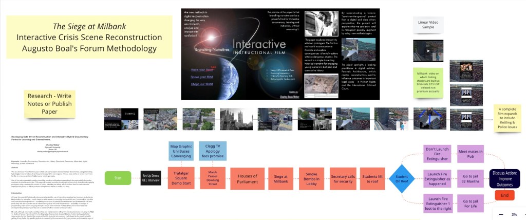
After years of gathering interviews and material on protest movements, from the UK student siege at Milbank through to the siege at Gezi Park, another major influence on me during my research studies was the work of Forensic Architecture. A Goldsmith based agency, it produces data driven, open source intelligence (OSINT) visual analysis for the ICC and broadsheet papers, reconstructing potential human rights violations by states, using various sources, like satellite pictures, bullet or explosion arcs and trajectories, the sun and shade along with API data taken together to produce most likely reconstructed scenario of events.
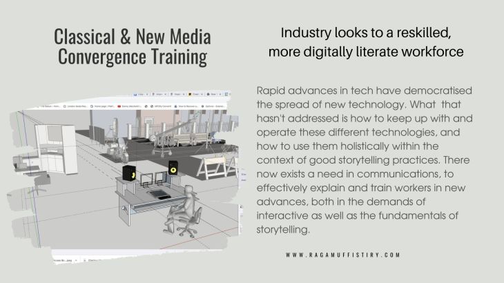
One of the main differences between digital, which are usually interactive in some way and, say, analogue linear media, is the volume of the data involved, and the subsequent need for a more organised filing, layout and modelling approach, due to the increased complexity.

For new media you should be using a digital worktop, such as Miro, to organise your materials, draw mind maps and flow charts on. It’s more difficult to ‘wing it’, like you sometimes can writing a book and to a lesser extent working from a film script, storyboard or cards. So the need for clear modelling of story and flow soon becomes apparent (see flow diagrams below).
You can access the interactive boards by double clicking and opening images on Miro (use mouse dial to zoom and right click to move around the page).
Modelling a Linear Project

Miro or Figma Jam Boards – the place to layout all of your project elements.
Not too complicated and if it were for film you’d add visual storyboard scene elements or shot sketches, more developed illustrations, like animatics – if you’re an agency – or actual location shots, taken either personally or by accessing Google Earth images (more on that, which I use a lot of and extracting ‘flyover’ videos later).
Modelling a Project with Interactivity
What happens to the flow charts of a story if we add a limited number of interactive narrative choices – here towards the end of the chart are three choices based on the reality of the reconstruction and two other slight variations. Does the protagonist act with integrity, compassion, or perhaps disregard all of those, and what are the outcomes of making one of those three story choices?
On either of the short courses, I go over the advantages of digital v analog, as well as the software, like Miro, Photoshop, Premiere Pro and DaVinci you will be using on the course. However, I encourage anyone interested in this kind of work to sign up and explore the Miro and Figma Jam and prototyping systems with a free account.
